So, lets talk about the error msg that is displayed in Aware. And lets JUST focus on the UI
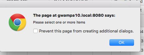
I have uploaded a screen capture of the error msg. Someone please keep count of all of the issues:
1st, it says: "The page at ....." This is meaningless for the end user. Why would I ever want to have them see the name of the server and the port
2nd, the actual error message: "please select one or more lines" is the SMALLEST font. So the most important thing on the msg is displayed as the least significant
3rd, For some reason, the user has the option to "prevent page from creating additional dialogs" The user has no clue what that means, but if they decide to click the option, then future error msgs dont show up
4th, the icon is just the standard chrome icon. Not an error icon, so it is conveying zero information
There are probably more issues with this, but was most of us know, its the sizzle, not the steak that sells the product at the steak restaurants. Could I suggest that the Show Error operation has 3 parameters, 2 of them option
1st. Title "This could be a short summary of what is wrong. Should be displayed in big font on the top. This can be optional and if left empty, it would say "ERROR
2nd. This is the Detailed error message. which is displayed below the title
3rd, an optional icon (and I can live without this)
Just my opinion.. .but please understand am working on 2nd (or 3rd) margarita, so I might not be explaining this as well as I would like to.
Bruce