I'm charting Orders for Stores/Locations.
Each Order record contains these columns already calculated by a Rule:
Orders.Chart1='['+SystemSettings.SQ+Orders.Affil+SystemSettings.SQ+','+Orders.NewP+','+Orders.ShippedP+'],'
Orders.Chart2='['+SystemSettings.SQ+Orders.Affil+SystemSettings.SQ+','+Orders.NewP+','+Orders.NewS+'],'
Orders.Chart3='['+SystemSettings.SQ+Orders.Affil+SystemSettings.SQ+','+Orders.ShippedP+','+Orders.ShippedS+'],'
Orders.Chart4='['+SystemSettings.SQ+Orders.Affil+SystemSettings.SQ+', '+AS_STRING(Orders.ShippedP+Orders.ShippedS)+'],'
which makes data that looks like this:
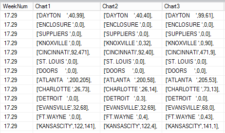
Now, the first thing to do NOW (if you have not done this) is to MANUALLY take some of your real data and get it working with a chart out in that Chart's testing tool on the web.
Then, you need to implement it in Aware via the Render Script WITHOUT merging data from a data source, but just using hardcoded data structures.
Then you'll see the structure that needs to be built behind the scenes.
Thats whats happened above.
Each Location (what I call Order, because its really the sum total of Orders for 1 WEEK at that location) has a string built thats conforms to the data you needed to MANUALLY have a working chart.
So, once all data points are in the correct form, just some looping needs to happen to string it all together.
NOTE: I'm building data for 4 charts at the same time - but In some cases below, I'm only following the looping to illustrate ONE of the charts. Charts 2, 3, 4 are similar.
The main loop :
// blank out the fields. loop thru locations. add a Header required by the charting program.
FIND RegularUser WHERE RegularUser=LoggedInRegularUser
RegularUser.Chart1=''
RegularUser.Chart2=''
RegularUser.Chart3=''
RegularUser.Chart4=''
BLoopThruOrderData
D1AddChartHeader
D2AddChartHeader
D3AddChartHeader
D4AddChartHeader
BLoopThruOrderData :
FIND Orders WHERE Orders.ob_Week=LoggedInRegularUser.ps_Week AND Orders.Active>0 ORDER BY Orders.Affil IN BATCHES OF 1
CAppendChartStrings
CAppendChartStrings :
//1st pass thru, the Chart1 field contains only the Chart Data for the 1st location.
//2nd pass thru, it has 2 sets now, etc etc
LoggedInRegularUser.Chart1=LoggedInRegularUser.Chart1+Orders.Chart1
LoggedInRegularUser.Chart2=LoggedInRegularUser.Chart2+Orders.Chart2
LoggedInRegularUser.Chart3=LoggedInRegularUser.Chart3+Orders.Chart3
LoggedInRegularUser.Chart4=LoggedInRegularUser.Chart4+Orders.Chart4
D1AddChartHeader :
FIND Charts WHERE Charts.ChartNum=1
RegularUser.Chart1=REPLACE_PATTERN(Charts.Header,'AW_TITLE',REPLACE_PATTERN(Charts.Title,'AW_PERIOD',LoggedInRegularUser.ps_Week.Disp))
+CHARS_FROM_LEFT(RegularUser.Chart1,LENGTH(RegularUser.Chart1)-1)
+']'
Charts Datafile is this:

This data was built for Anychart.
It has a bunch of Javascript, but ultimately when the actual chart is described, it has
TITLE
HEADER
ROWS
So I made a BO to hold that info, rather than hardcoding it into the Render Script.
So you can see it dynamically REPLACES the selected Period (ie. 'Week 29, ending 6/30/2018" ) INTO the TITLE.
Then REPLACES the TITLE into the HEADER.
Then adds the big string of data points after "rows: ["
Strips off the trailing ","
And closes the "rows" data array with a final "]"
Now the data is all in the field: RegularUser.Chart1
Here is the beginning of the Render Script of a VP content panel:
anychart.onDocumentReady(function() {
chartData = {
<<LoggedInRegularUser.Chart1>> <---
};
// create column chart
chart = anychart.column();
// set chart data
chart.data(chartData);
<snip>